Air quality in Europe - 2016 report
The 'Air quality in Europe' report series from the EEA presents regular assessments of Europe's air pollutant emissions, concentrations and their associated impacts on health and the environment.
Based upon the latest official data available from countries, this updated 2016 report presents a number of new elements, including:
- updated information on air pollutant emissions, concentrations, and urban population exposure data (for year 2014);
- new concentration maps for carbon monoxide, benzene and the toxic metals arsenic, cadmium, lead and nickel;
- updated assessments of air quality impacts on health, vegetation and ecosystems;
- a review of the emissions and air quality impacts caused by residential biomass combustion;
- trend analyses of particulate matter, ozone, nitrogen dioxide and benzo[a]pyrene concentrations.
Maps (zoom):
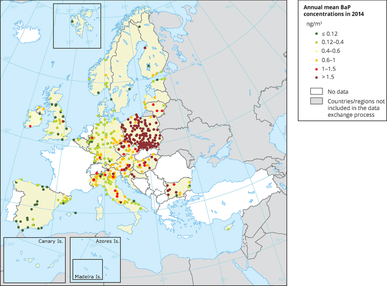
Fig. 1 Observed concentrations of BaP in 2014.
The map shows the BaP annual mean concentrations. The dark red dots indicate stations with exceedances of the annual target value (1 ng/m3). The dark green dots correspond to concentrations under the estimated WHO reference level (0.12 ng/m3). Only stations with more than 14 % of valid data have been included in the map.
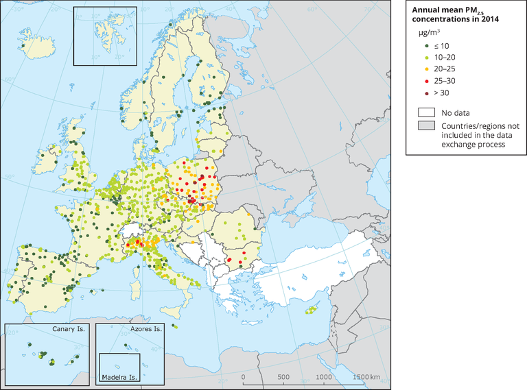
Fig. 2 Observed concentrations of PM2.5 in 2014.
The map shows the PM2.5 annual mean concentrations. The red and dark-red dots indicate stations with concentrations exceeding the target value (25 μg/m3). The dark green dots indicate stations reporting values below the WHO air quality guidance for PM2.5 (10 μg/m3). Only stations with more than 75 % of valid data have been included in the map
Fig. 3 100-year daily peak flow (Q100).
Relative change for the time slices 2006-2035, 2036-2065 and 2066–2095 compared to the ensemble mean of the baseline (1976–2005), based on an ensemble of EURO-CORDEX RCP8.5 scenarios. Data points with CV>1 are greyed out. (CV = coefficient of variation)
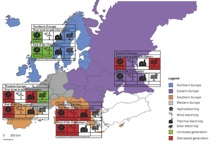
Fig. 4 Impacts of climate change on electricity production
This map shows the projected impacts of climate change on electricity production from four different sources in four European regions. Green denotes positive impacts whereas red denotes negative impacts.
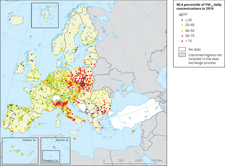
Fig. 5 Observed concentrations of PM10 in 2014.
The map shows the 90.4 percentile of the PM10 daily mean concentrations, representing the 36th highest value in a complete series. It is related to the PM10 daily limit value, allowing 35 exceedances over 1 year of the 50 μg/m3 threshold. The red and dark-red dots indicate stations with exceedances of this daily limit value. Only stations with more than 75 % of valid data have been included in the map.
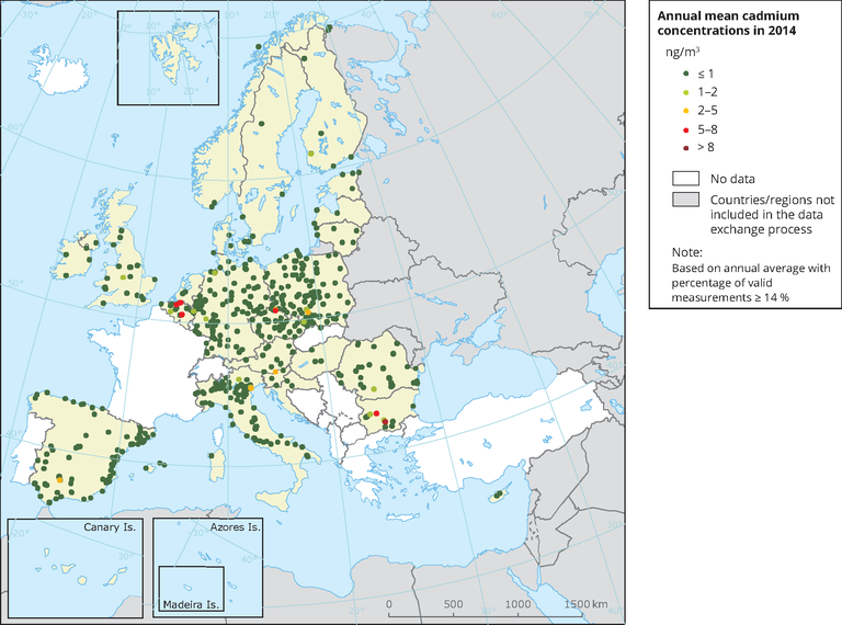
Fig. 6 Observed concentrations of cadmium in 2014.
The map shows the cadmium annual mean concentrations. The red and dark red dots indicate stations with exceedances of the annual target value (5 ng/m3). Only stations with more than 14 % of valid data have been included in the map.
Fig. 7 Observed concentrations of benzene in 2014.
The map shows the benzene annual mean concentrations. The dark red dots indicate stations with exceedances of the annual limit value (5 µg/m3). The dark green dots correspond to concentrations under the estimated WHO reference level (1.7 µg/m3). Only stations with more than 50 % of valid data have been included in the map.
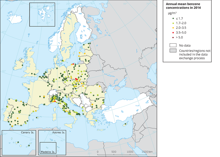
Fig. 8 Observed concentrations of benzene in 2014.
The map shows the benzene annual mean concentrations. The dark red dots indicate stations with exceedances of the annual limit value (5 µg/m3). The dark green dots correspond to concentrations under the estimated WHO reference level (1.7 µg/m3). Only stations with more than 50 % of valid data have been included in the map.
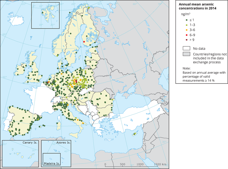
Fig. 9 Observed concentrations of arsenic in 2014.
The map shows the arsenic annual mean concentrations. The red and dark red dots indicate stations with exceedances of the annual target value (6 ng/m3). Only stations with more than 14 % of valid data have been included in the map.

Fig. 10 Observed concentrations of nickel in 2014.
The map shows the Ni annual mean concentrations. The red and dark-red dots indicate stations with concentrations exceeding the target value (20 ng/m3). Only stations with more than 14 % of valid data have been included in the map
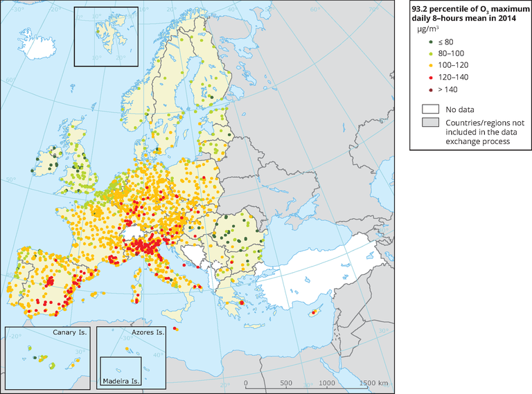
Fig. 11 Observed concentrations of O3 in 2014.
The map shows the 93.2 percentile of the O3 maximum daily 8-hour mean, representing the 26th highest value in a complete series. It is related to the O3 target value, allowing 25 exceedances over the 120-μg/m3 threshold. At sites marked with red and dark-red dots, the 26th highest daily O3 concentration exceeded the 120-μg/m3 threshold, implying an exceedance of the target value threshold. Only stations with more than 75 % of valid data have been included in the map
EEA 2016
Collegati
Allegati
|
Descrizione |
Lingua |
Dimensioni |
Downloads |
 |
|
EN |
11116 kB |
1457 |


